Client: Land to Sea
Year: 2021 - Present
Art Direction & Design: Meijun Li (Overice)
Illustrations: Meijun Li, Jane Zhang

Land to Sea is a creative space, a coffee shop that puts community and culture first. Emily and Eva, both daughters of immigrants, want to create a space inspired by their heritage and memories of their childhood.

Land to Sea was born from a longing for ‘home’—a feeling beyond physical space. It’s about history, memories, and the small comforts of daily life, like the lucky cat’s wave or the warm, nutty smell of morning coffee. It’s a celebration of the sights and scents that make a place truly feel like home.

Inspired by Wong Kar-wai and 70s Hongkong, street signs, and mahjong. The logo embodies who they are and where they come from, and expresses Chinese heritage with a touch of contemporary aesthetics. It resembles a seal often found on traditional Chinese art scrolls with a modern element to it. It feels nostalgic but at the same time relevant.

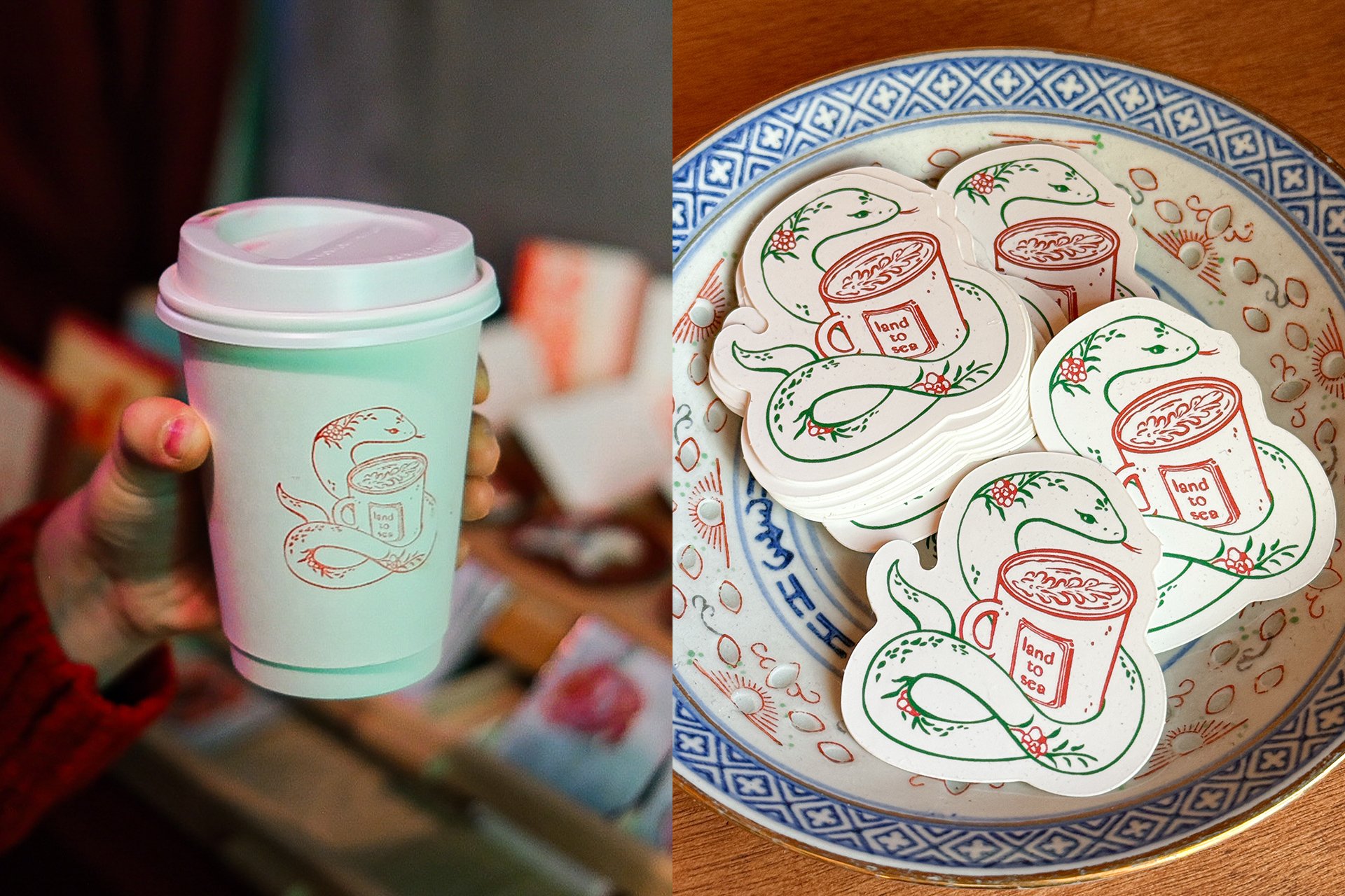
Mahjong tiles have become a defining element of our brand identity, representing the deep connection between our space and the vibrant community it fosters. To carry that sense of familiarity forward, the Year of the Snake design draws inspiration from the intricate Flower tiles of a traditional Mahjong set that feels both nostalgic, familiar and new — strengthening the brand’s story and its bond with the community.

To celebrate the Lunar New Year, we crafted a series of bespoke illustrations that embodied the festive spirit and cultural richness of the holiday. These vibrant and playful designs were applied across a variety of mediums, including greeting cards, cups, stickers, and more. 

For the Land to Sea x Dae Tea collaboration, we crafted a tea tin label that beautifully captures the warmth of sharing tea with a friend or the comforting familiarity of visiting your grandma’s home. The designgives a vintage charm that feels both nostalgic and inviting, blending traditional influences with a modern sensibility.

I began my drawing practice from traditional Chinese painting, this project allowed me to reconnect with my roots, drawing inspiration from the rich heritage and timeless beauty of classic art forms.

In addition to the main label, I illustrated the icons in the similar style for the instruction page, ensuring a seamless visual flow across all sides of the packaging.