Client: Wenwen
Year: 2021 - Present
Art Direction & Design: Meijun Li (Overice)
Illustrations: Meijun Li, Jane Zhang
Photo Credit: @scoboco, Adam Friedlander Meijun Li
Created by the team behind 886, Wenwen offers a warm embrace of Taiwanese household flavors and comfort in the heart of Greenpoint, Brooklyn. The branding I developed for Wenwen remains deeply rooted in Taiwanese culture, evolving from the playful vibes of 886 into a more mature and timeless expression. This brand carries a sense of nostalgia and delicacy, reflecting the rich layers of tradition and memory.
The logo design takes inspiration from vintage Taiwanese street and disco dance club signs.
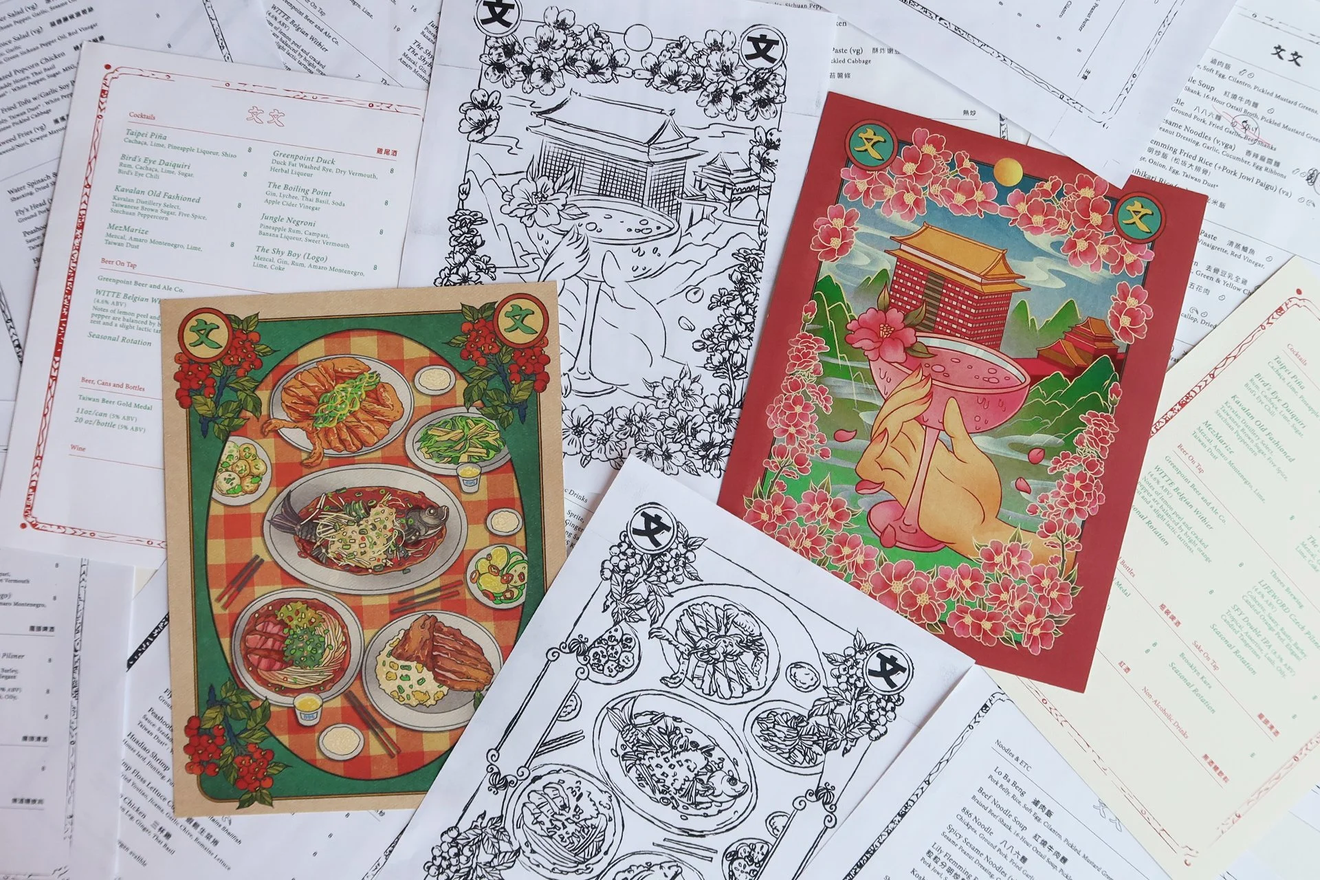
The menu covers are collages of elements from 365風俗考察II (“Taiwanese Social Custom Expedition 365 Days Calendars”) by Taiwanhaose. Each cover is a collaborative creation by Mei (Overice) and Wenwen’s friends and family, making every menu unique with its own story to tell.
After conceptualizing and drafting the rough layout, and with the support of illustrator Jane, I was able to bring the menu to life with the beautiful two full-frame illustrations.
Drink Menu: The illustration features the signature cocktail Shyboy at Wenwen, with 圓山大飯店 (The Grand Hotel Taipei) nestled against the mountains, framed by Taiwan’s iconic plum blossoms.
Food Menu: Inspired by the warmth of grandma’s dinner table, this artwork captures the essence of “homesickness.” It depicts family gatherings filled with laughter and togetherness, with dishes spread across a gingham-covered table—a familiar sight in many Asian households.
To enhance the nostalgic feel, I applied vintage treatments to the artwork and printed them on thick, textured paper, resulting in the old newspaper-like finish.
Wenwen’s signage and select Instagram announcements incorporate the custom illustrations and frames developed during the menu design process. These elegant, bespoke illustrations flow seamlessly throughout the brand’s physical and digital spaces, establishing a cohesive and consistent brand identity.
Seasonal Cocktail Menus:
The process of creating these graphics felt much like preparing for a photoshoot. Elements like space, lighting, setup, and cropping were all crucial.
I approached each design with the same attention to detail as I would for preparing a shoot— planning every aspect and bringing the composition to life in Photoshop, where I could experiment with lighting and perspective to create depth and visual impact.
Once the foundation was set, I collaborated with illustrator Jane, who executed the final illustration with precision, ensuring each poster was beautifully polished and ready to shine.
The Process ↗
The space itself is a treasure trove of nostalgic charm, filled with vintage signs, original posters, night market toys, and rare finds that transport guests and also me straight to the bustling streets of Taiwan, it inspired me to create around it.
Shaved Ice Saturdays at Wenwen
Every Saturday during the summer, Wenwen brought the nostalgic joy of Taiwanese street-style shaved ice to Greenpoint. The neighborhood came alive with families, kids, and dogs, all gathering to enjoy a simple, refreshing treat—just pure joy and fun.
I created a series of signage and Tshirt inspired by risograph printing and the charm of rubber stamp effects, which was created layer by layer, mimicking the Riso printing process to capture its raw textures and playful imperfections. It was so much fun!
Beef Noodle Soup Cafe
This small, fun project was my way of paying tribute to the street food experience from my childhood. I designed the menu to evoke a wholesome, vintage, and homey feel—pairing the menu with clipboards and vintage pencils to create a nostalgic yet simple, exciting and approachable ordering experience.
Special Events Collateral ↓


